
What is DNANuexus?
A cloud-based genome informatics and data management platform for DNA sequence/genomic data.
Problem
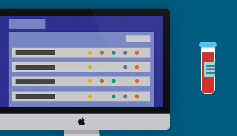
Users have a difficultly understanding current job running processes at a quick glance (i.e. what is running/failed/completed), user must descend (click multiple layers down) into working directories to find status.
Solution
For the users to see all running/completed/failed jobs on their dashboard at a glance, as the graphic suggests - using a simple progress bar.
DNANexus project brief

DNAnexus is a cloud-based genome informatics and data management platform, and is accelerating genomic medicine by making it easier to work with genomic data and tools. When I was sequencing genomes in a lab, I was a huge proponent of this cloud based platform and knew it had a place in the future of genomics (or something like it). Although working with the pipeline interface UI wearing a genomics and UX hat, I uncovered some paucities that I wanted to convey to DNAnexus guys down in Mountain View. I made this to present to the UX and engineers at DNAnexus in one night before a presentation to them.
Process
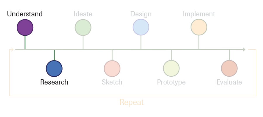
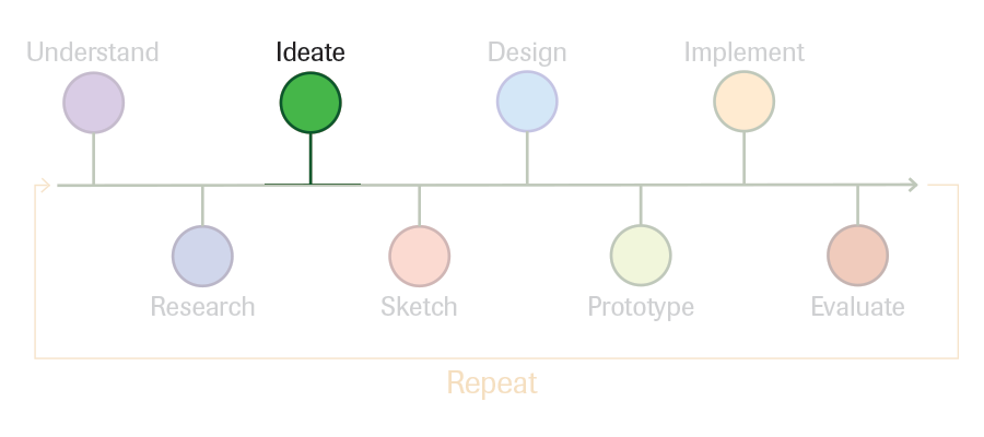
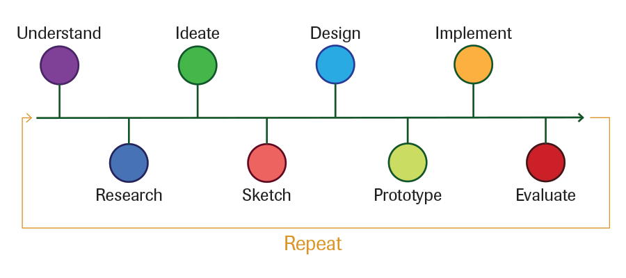
Overview of entire UX process
Every UX process is different for the task at hand, but generally a similar linear path. I'll lead you through this process with visual representation of the steps below.
Status quo/problems from users
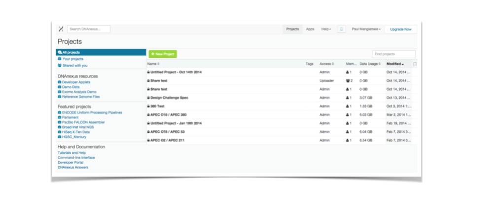
Current Screen shot of DNANexus' right now
To give you an idea where we are starting out.
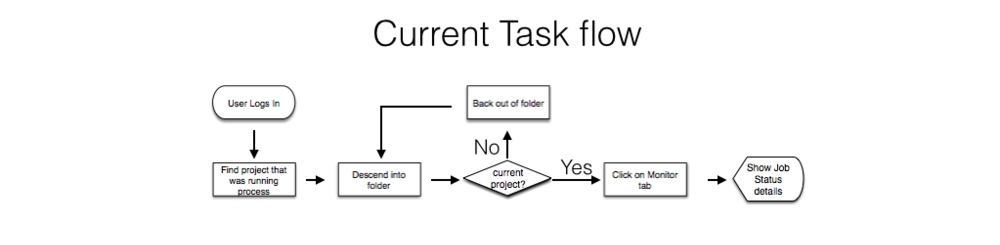
Current task flow for users
Job running processes are difficult to understand at a quick glance, users must descend into working directories to find the information they need.
Ideate solutions for user issues
UNCOVER CONSTRAINT through questions
- Why/How how you arrived at the current solution on monitoring? Engineering: What are the system-based reasons for current flow? UI/UX: User based reasons?
- What are current user flows for monitoring projects? (Beyond face value) On an analytics analysis are there friction/obvious pain areas? Or user feedback areas?
- Why display the current information on “Home” screen? (i.e. Name of project, owner, people in project, size) Is this flexible? Possibly customizable on a systems level? UI (Membrane) level?
- What data in monitoring information is abstract-able past its current project folder?
solutions brainstorm (possibilities)
- Add pertinent data information to “home” for each project running jobs (small change, big impact)
- Devoted jobs dashboard to find and search all jobs (running/completed/failed)
- Personalization approach. Have setting under profile that can modify “Home” view information.
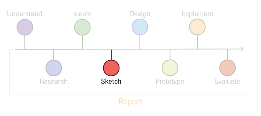
Sketch out ideas
1st iteration - VISUALLY EXPLORING DESIGN SOLUTION
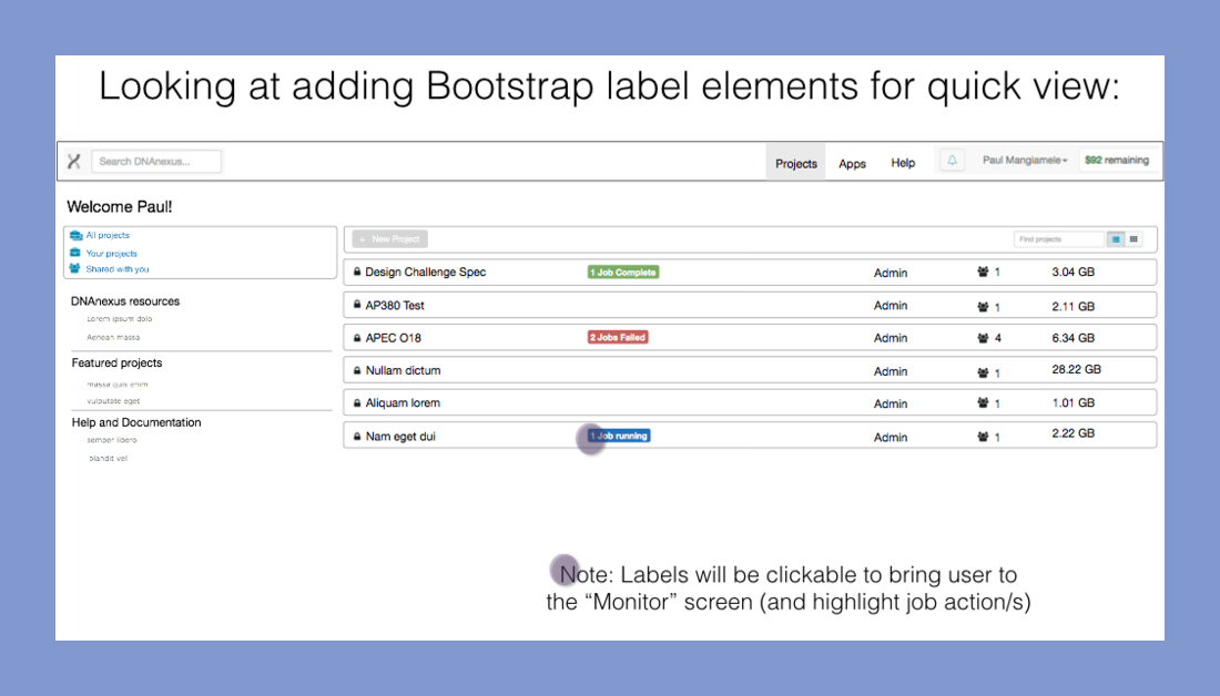
- Add pertinent data information to “home” for each project running jobs (small change, big impact)
- Add button/label bootstrap elements to deliver job data to “Home” for each project running jobs
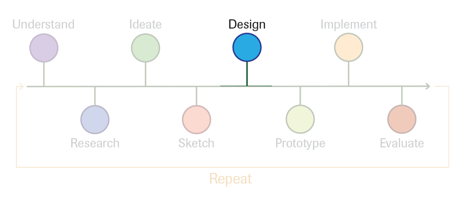
Sketch to wireframe
1st iteration - building basic designed elements into interface
Task Flows:
- User logs into DNAnexus and sees previous screen
- They can quickly attenuate to “attention areas” (failed jobs, running jobs, etc.)
- It is a quick link into the “Monitor” screen to dig deeper on each job.
Questions:
- On a scale compared to the rest of the UI elements, how import is this job information?
- Would the user be interested in current job status (progress)?
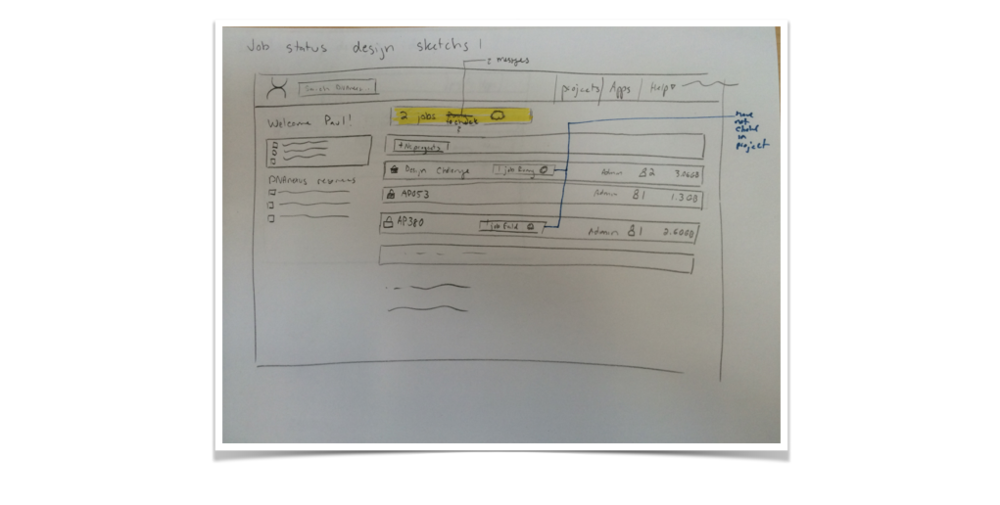
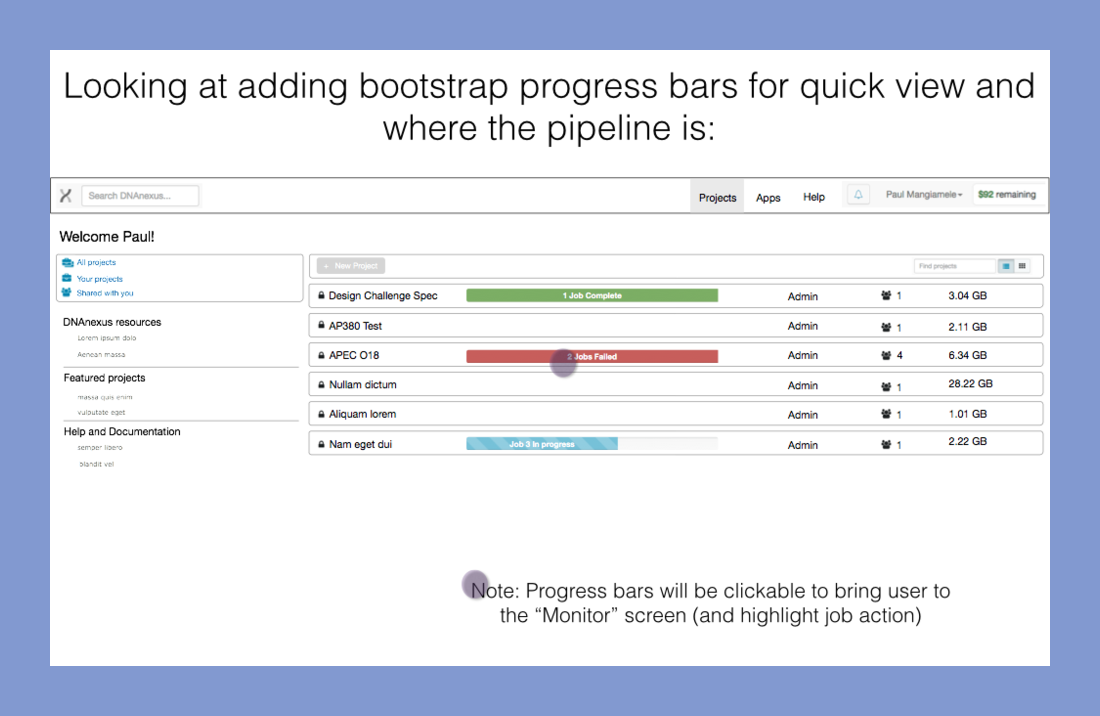
2st iteration - building better status indication
Task Flows:
- User logs into DNAnexus and sees previous screen
- They can quickly attenuate to “attention areas” (failed jobs, running jobs, etc.) as well as where in the progress current running jobs are (many ways to visualize to user, for sake of brevity, we will go with total steps in workflow)
- It is a quick link into the “Monitor” screen to dig deeper. (I may suggest changes within the “Monitor” page from here, but for keeping on point it would be out of scope)
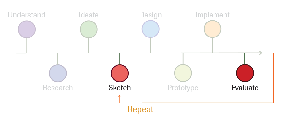
Quick rev from user feedback
Problem with above design
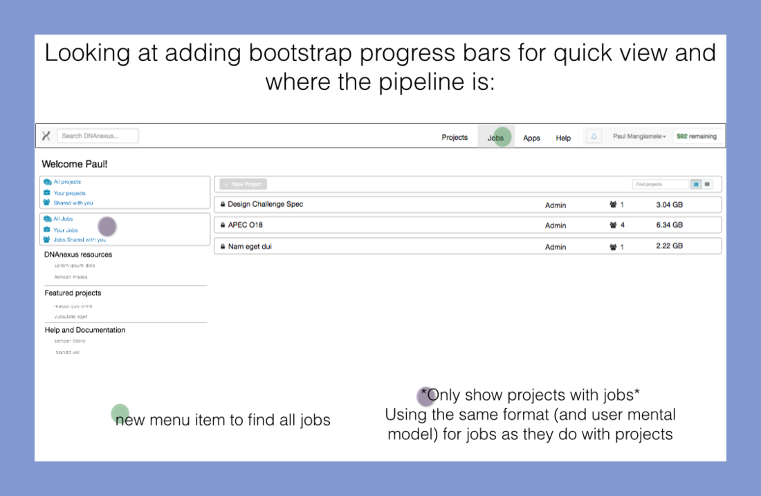
Mixing older completed runs with current jobs may be confusing for users, creating a susinct list may be helpful
Sketch out augmented solution
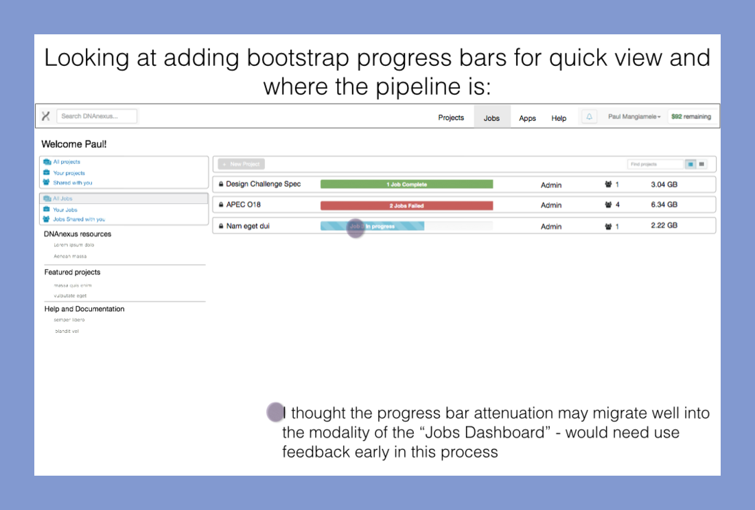
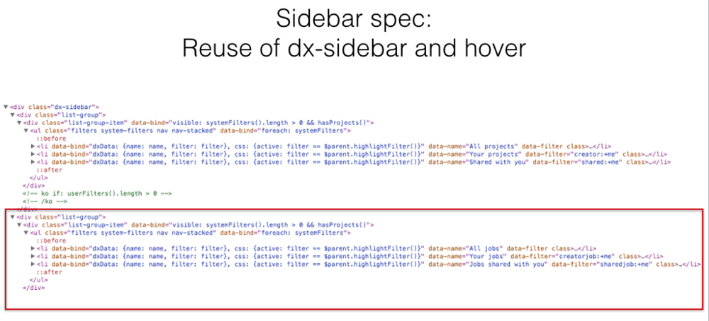
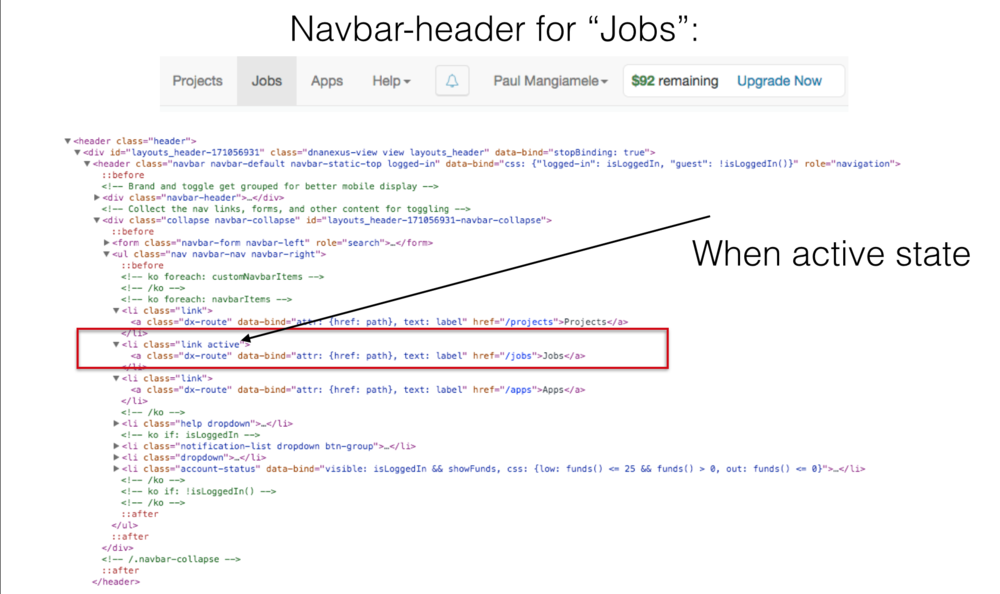
Adding a “Jobs” tab in the top navigation, as well as a left hand navigation menu option mirroring the “Projects” choices to list (All Jobs, Your jobs, Jobs shared without.)

Setch out augmented solution
Adding a “Jobs” tab in the top navigation, as well as a left hand navigation menu option mirroring the “Projects” choices to list (All Jobs, Your jobs, Jobs shared without.)
Setch out augmented solution
Adding a “Jobs” tab in the top navigation, as well as a left hand navigation menu option mirroring the “Projects” choices to list (All Jobs, Your jobs, Jobs shared without.)
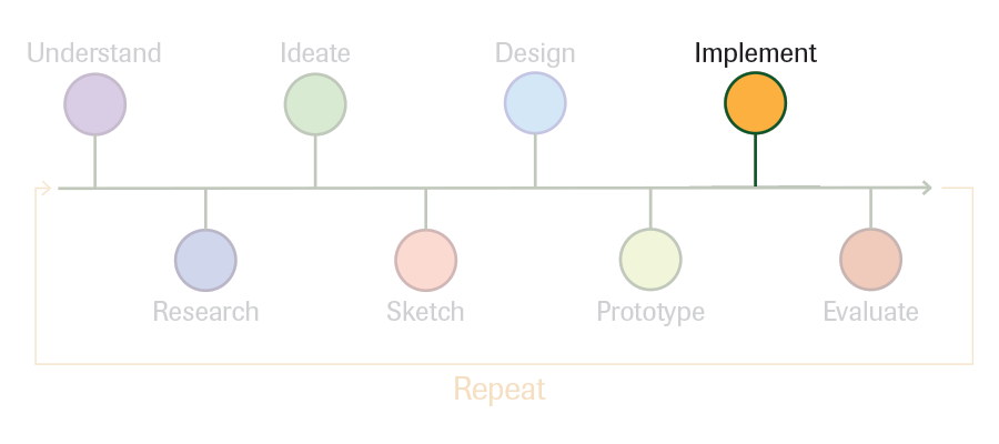
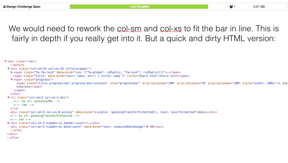
Code snippetss
A few pics of basic code changes
Not getting too in-depth, as this is a bit out of scope for a UX project - but here are some basic changes highlighted using "Inspect" on Google Chrome
Solution
Design is never done
The end result
- Navigation is significantly improved
- Reduce clicks to find pertent information
- Users have a better idea of current status of runs
- Ease of use
But true design is never done and can always be improved. This was a super fast (one evening of thought) turn around to make small improvements using a standard UX process, this need much more work and thought. Although if you look at the current interface thet still have nothing like this...