Problem
Customer service support who interacts directly with customers at Workiva were not logging complete information in an accessible, searchable way via current custom SalesForce app. Much of the data was incomplete as the CSRs were trying to fix the customers problem and not able to write everything down during the call. Salesforce does odd one-off UIs apps often without proper UX groundwork.
Solution
Build a rapid, but fully functional prototype to test with users on real calls. Guiding users to log the metadata associated with each customer call, and translate that information into downstream actionable data.
Users
Internal customer service representatives.
About project loop
I was the first UX Prototyping Engineer Workiva hired to complete a few projects they needed updating on but did not have dedicated the resources. I got to talk to actual users, think of my own designs, then build quick prototypes using Ruby on Rails, Bootstrap, and Google compute to deploy new designs on weekly sprints to test with users.
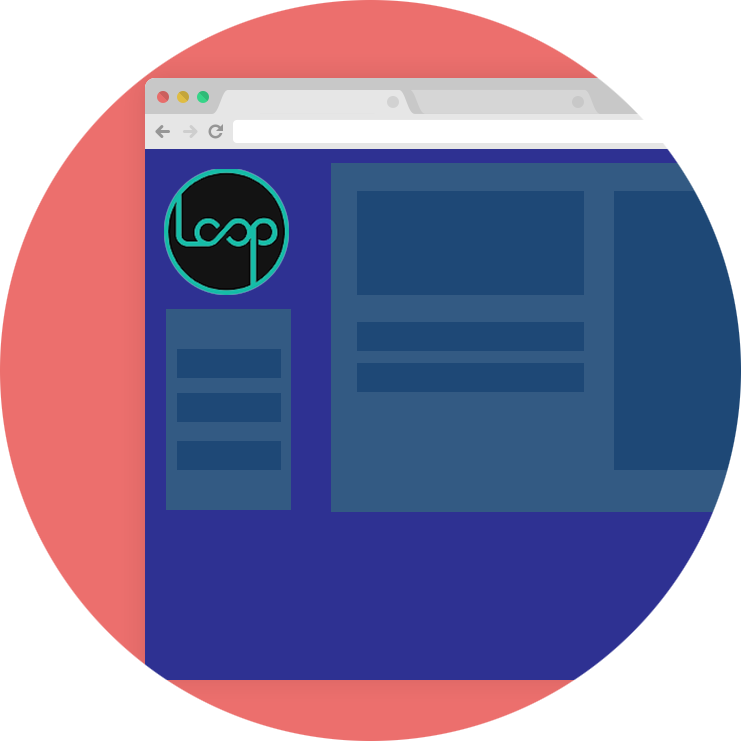
This is a responsive twitter-like internal app that allows various departments to log data from calls with customers (a large part of the business) to have everyone "stay in the loop". The overall goal of this project is to get users to actually log the data (current SalesForce app is lacking with many friction points, thus user input suffers) so the right departments can be notified of issues (trending or one-off issues) without an overuse of JIRA. The metadata and details from customer feedback getting to the right places sis integral with making better products in general (I see this everyday in my job now).
Process
Framing the problem
Customer service representatives were not logging calls reliably in the current SalesForce system. There were many pain points in the process and the data input was simply text (not searchable, indexed, nor organized) - yes, one big CSV.
USER RESEARCH
Watch users! After walking around to just a few of the CSRs desks and being a fly on the wall, there was some apparent problems with the current system:
- 8-9 clicks to START entering a call into the current system
- Basic PHP form was all free text
- No feedback after submit (blackhole)
Gather more quantitative evidence such as surveys and user interviews.
IDEATE SOLUTION
After pulling together the user research of we all had a UX Jam to quickly generate ideas for a prototype using the following process:
- 10 min. Talk about the problems explored with users
- 5 min. Individual exercise: put possible ideas and function
- 5-10 min. Talk/Mini presentations on their ideas and put in an affinity diagram and group on the fly
- 15 min. Individual. Take these ideas on the board and sketch into very basic wireframes for possible solutions
- 10 min. Present the solutions to the group
- 10 min. Vote on screens (with small post its)
- Pull together all interfaces and storyboard - bridge any gaps and overlaps
Gather more quantitative evidence such as surveys and user interviews.
Prototype
Prototype validate with team validate with users
Repeat!
Gather more quantitative evidence such as surveys and user interviews, as well as input on new prototype.
1st iteration and design pass - mobile first
Low to high fidelity
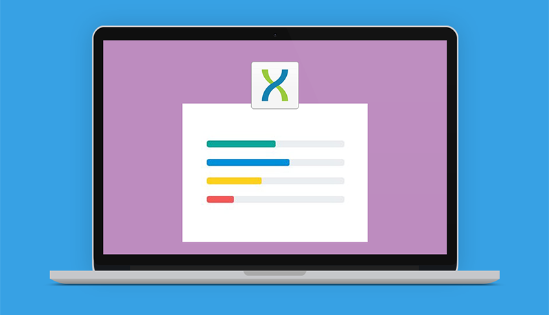
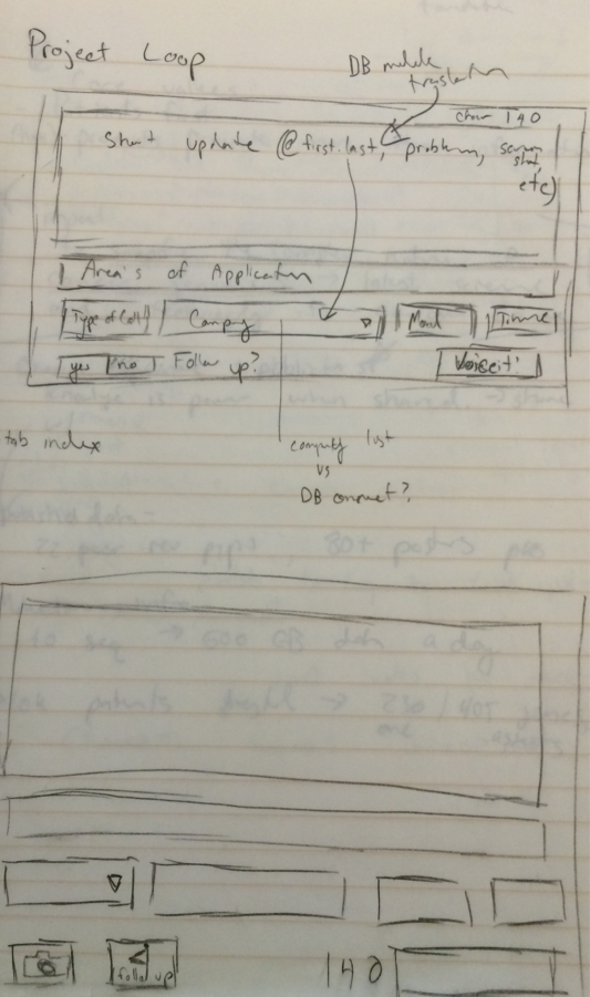
After watching users struggle with the Salesforce app, I reimagined what an interface would look like that would be more efficient. I sketched this up and also show how I hooked it up to a local database with variables. Then translated to code in < 1 day.
2nd iteration and design pass - desktop edition
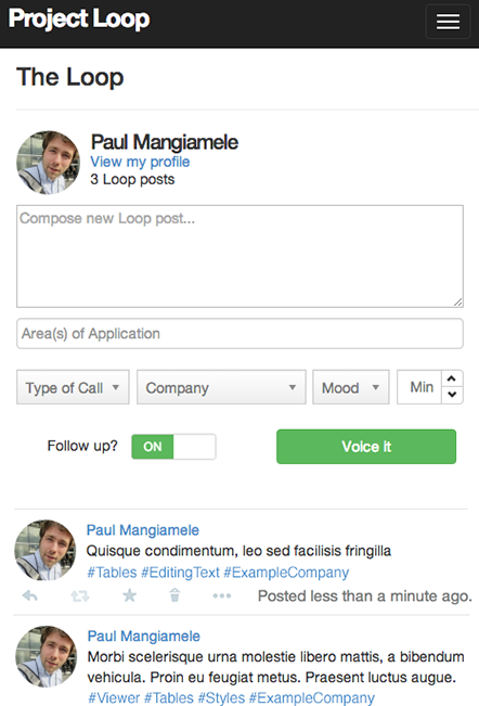
1st iteration of the loop desktop application
Feedback from users was that they will be using a desktop version of the software more than mobile (initial assumption) so I began a responsive app that worked on all platforms.
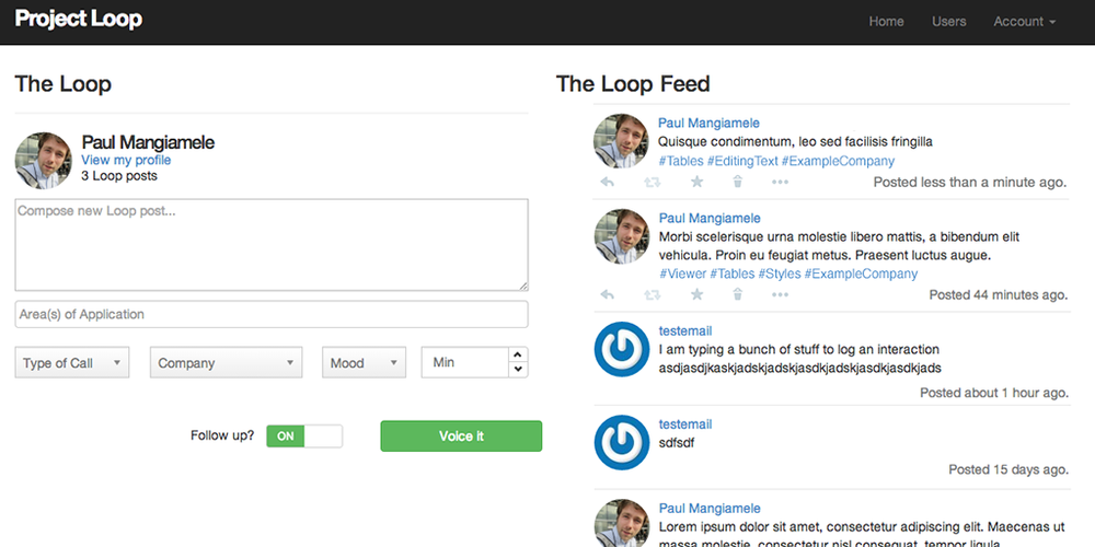
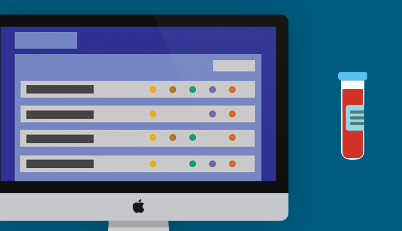
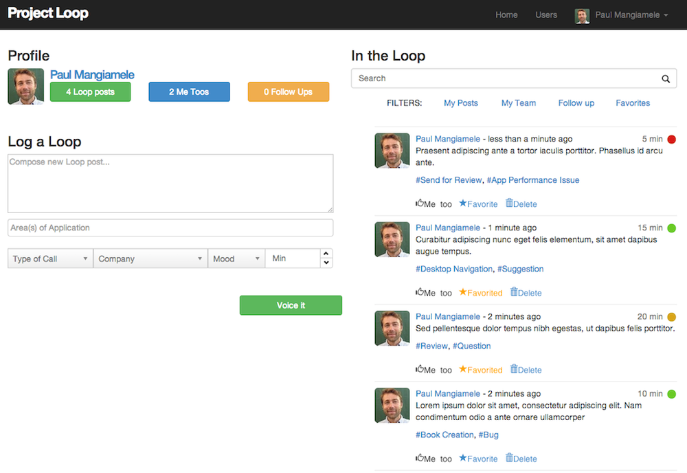
2nd Iteration of the desktop version
After testing the new responsive application with users I learned that the stats (posts, "me toos", and follow ups) needed to be more prominently displayed, also other little small optimizations with the form.
Solution
Design is never done
The end result (for now)
- Reduce clicks to entry
- Social collaboration (you can see what other CSRs are logging)
- Searchable by users/administrator/manager by hash tagging and metadata
- Ease of use -> mental model already established (Twitter-ish)
But true design is never done and can always be improved. I made large improvements from the original Salesforce app. I also started streaming the customer complaints into the TV screens (through the feed) around the office so employees can see customer complaints as they come in at real-time. This app became quite popular with the UX researchers for better organization of information.
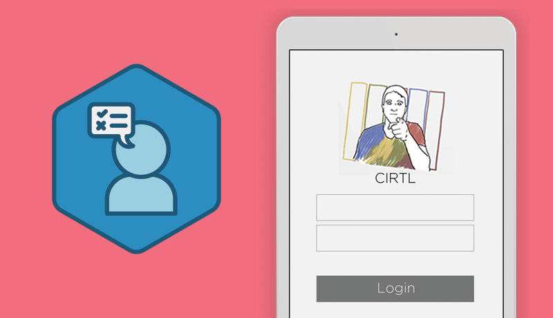
Check out the Loop app
Log in and play with the Loop app, all you need is a Google account for SSO (single sign on) authentication